
This project was a direct CASE of the book (remembering the book was 'when I was five... now I am six...'). It is a double page layout, but one of the things I really like about this idea, is that each page would work just as well as a separate, stand alone layout. I'm going to put them in the album together, but one day down the track, if we want to change it around, we can. That way I also get to count it as two projects. That is important. I need all the projects I can get on the done pile!

So, to the details. The colour of the card and patterned papers is Baja Breeze - I think this may be a happy replacement for the recently retired soft sky that I was rather fond of. The numbers were from the great SU 'Simon Lower' chipboard set- also recently retired (I know, that is not helpful to you, but hey - check me out! I'm using stuff from stash!) covered with the baja paper, then sponged with a little ink around the edges. Letters for the titles were rubons from a pack I got from Warehouse Stationery in Tauranga, a while ago - Color Rubz 'Upper West Side' by Scrapworks. Great value! I will be sad when I finally get to the end of the pack (more stash stuff used though!)

Another paper from the Baja Patterns paper pack was used for the layout background panel, and a third paper was used for the journaling blocks (the lines on the paper made that easier).
To add a little interest, (and because I was experimenting a bit!) I wet the edges of the patterned papers, and rolled them up to create a border. Wetting the paper first makes it easier to crumple it the way you want, and an added bonus is that when it dries it stays where you put it. I used an aqua painter, but a wet cotton bud will do the job just as well.
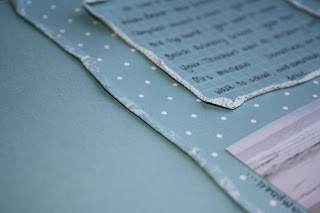
These double sided papers were especially good for this technique - you get to see a hint of the reverse, but because the same colours are used it is kind of a subtle effect - not too in your face and distracting.
That was about as complicated as it got. The rockets were cut from a basic grey patterned paper and the dinosaurs were stamped using the prehistoric pals stamp set, and a mixture of old olive and choc chip ink (NZ readers, pretend you didn't read that bit about the dinosaur stamps - hopefully this stamp set will be coming to a mini catalogue near you soon!)

Most of the journaling was in the boxes, but some I added around the outside of the photos and the rocket/dinosaur. I am really liking the idea of journaling that doubles as a frame. I think this is also a good way to get started with handwritten journaling if you are not usually a fan (I used to HATE it!) - somehow it just isn't quite so in your face as a big block of journaling might be.
I think what I like best about this project, is that Hayden got to have some input. Often, other than posing for photos, or saying or doing something silly/funny/clever etc, my kids don't get a lot of input into how the projects get put together. This time it was all about what Hayden's interests and activities were - and who better to tell me what they were than Hayden himself! I really enjoyed seeing him look at the finished project, and see what I had done with his ideas - the things that were important to him. A wonderful reminder of why it is we do this scrapbooking thing!
A little bit of blog stuff to end on - I am still trying to figure out why the heck some photos can be enlarged when you click on them, and some (all of these!) don't. Sorry about that. Any ideas please let me know!


No comments:
Post a Comment